
by Monica Nita | Jun 26, 2020 | Color
Saturation illustrates the degree of purity of a color. By contrast, transparent colors are diluted colors with low intensity. Contrast of saturation is the contrast between pure, intense colors and the diluted ones. You could experiment with the degree of saturation...

by Monica Nita | Nov 19, 2019 | Book
One day, Mr. II, to be read Mr. Two, a usual spiridoko, found an unusual pen with a golden nib and a wooden holder with the name of the owner carved on it. Only by holding the pen, the spiridoko would experience space orientation problems followed by numerous waves of...

by Monica Nita | May 3, 2019 | Color
The light/dark effect is used to create drama and realism in a composition. It helps you define the environment and the characters. The strongest outcome is achieved by using black and white, milder effects are produced by using an array of greys of different...
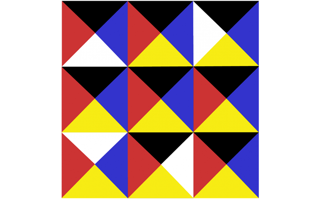
by Monica Nita | Apr 10, 2019 | Color
Let’s take the color wheel as a starting point and dive in more ways to achieve color harmony. One way is the contrast of hue, which requires at least three saturated and pure colors to create tonic effects. As in the above picture, the strongest statement is...

by Monica Nita | Mar 25, 2019 | Book
Sweet dreams!Download your copy of the LITTLE PAGES mini-book!...