
by Monica Nita | Jun 26, 2020 | Color
Saturation illustrates the degree of purity of a color. By contrast, transparent colors are diluted colors with low intensity. Contrast of saturation is the contrast between pure, intense colors and the diluted ones. You could experiment with the degree of saturation...

by Monica Nita | May 3, 2019 | Color
The light/dark effect is used to create drama and realism in a composition. It helps you define the environment and the characters. The strongest outcome is achieved by using black and white, milder effects are produced by using an array of greys of different...
by Monica Nita | Apr 10, 2019 | Color
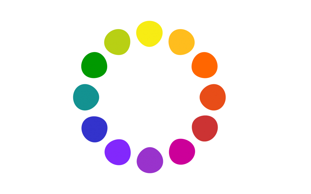
Let’s take the color wheel as a starting point and dive in more ways to achieve color harmony. One way is the contrast of hue, which requires at least three saturated and pure colors to create tonic effects. As in the above picture, the strongest statement is...
by Monica Nita | Mar 24, 2019 | Color
Harmony is a tough topic because it is entirely subjective and it refers to how attractive or unattractive a color combination is to each individual.According to the great color theoretician Johannes Itten, two or more colors are harmonious if their mixture yields a...

by Monica Nita | Mar 24, 2019 | Color
Now, let’s make some experiments. Let’s work digitally or paint on a piece of paper, the effect is the same. We will use light or dark grey rectangles to enhance the effects that we are going to illustrate with the squares. A white square on a black...

by Monica Nita | Mar 24, 2019 | Color
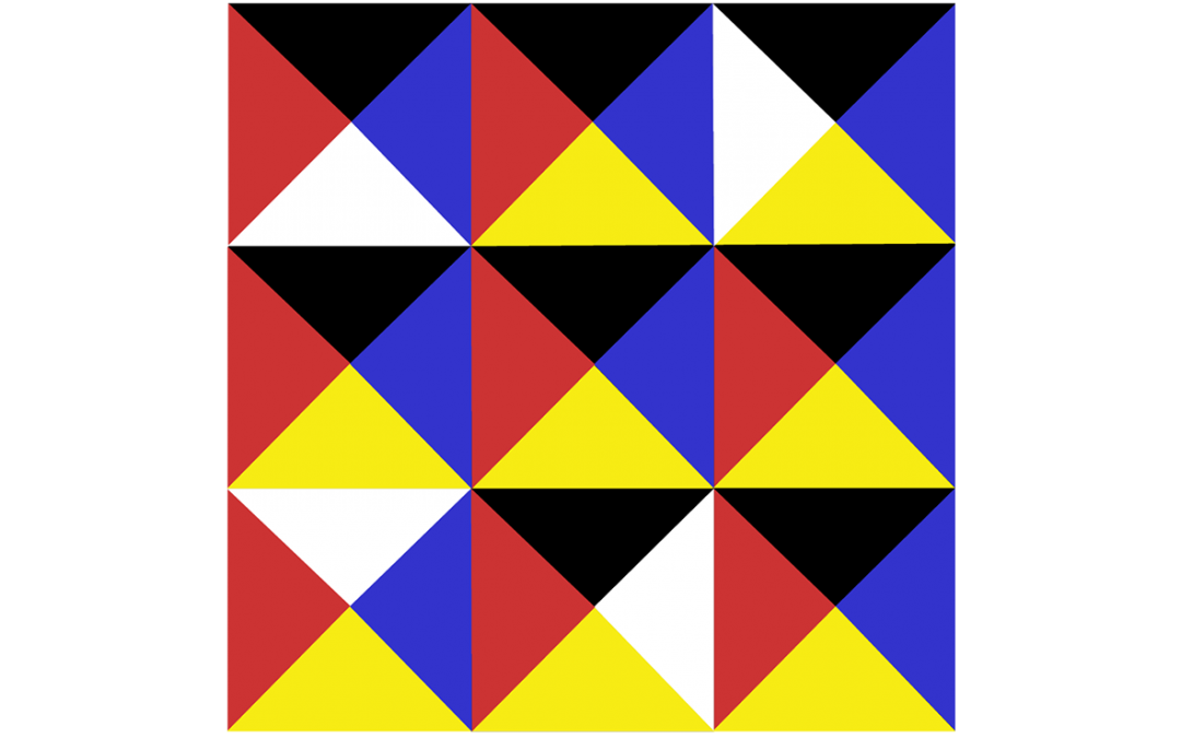
The primary colors are: RED, YELLOW and BLUE and the noncolors (neutrals) are: BLACK, WHITE and GREY.■ Secondary colors are created by mixing equal quantities of two primary colors in order to achieve: ORANGE, GREEN and VIOLET.■ Tertiary colors are created by mixing...